This little interactive dashboard I made is a recreation of the animation shown on the video below.
The video (from 3:15 to 5:14) shows Hans Gosling describing how countries have trended in terms of Population, Fertility Rate, and Life Expectancy at Birth between 1962 and 2003. Gosling used a software called Trendalyzer to create the animated bubble chart he used in his presentation. The current version of the software (now called Gapminder Tools) is a completely free web app that is available at www.gapminder.org.
This type of visualization is relatively simple to recreate in Tableau. All that’s really needed is to add a Year field on the Pages shelf.
Concepts/Features:
- Tableau Animation
- Data Blending
- Screen Recording
The Dashboard:
Click the link below to download the Workbook file plus the data I used for this dashboard.
I do have the dashboard published on my Tableau Public profile. However, the main feature of this dashboard, i.e., the ability to animate changes over time, is currently limited to the desktop versions of Tableau (Tableau Desktop or Tableau Public). As you can see from the embedded version below, the playback buttons are gone. You can’t automate the animation; you can only manually change the slider to see the changes by year.
Update: Playback buttons have been added to Tableau Public as of 02/24/20 (ver. 2020.1). The following embedded dashboard now have the ![]() button to let you automate the animation. The ability to control the speed, however, is still limited to the desktop version.
button to let you automate the animation. The ability to control the speed, however, is still limited to the desktop version.
If you don’t have either of the desktop versions, I prepared a set of screen recordings showing how the dashboard functions.
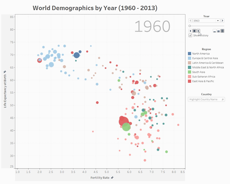
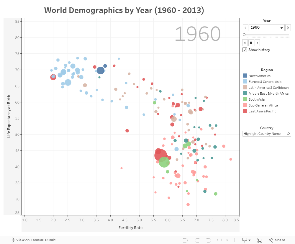
The bubble chart describes three metrics: population size, fertility rate, and life expectancy at birth. Each bubble is a country, and the size of the bubble corresponds to the country’s population size at a given year. The color of the bubble corresponds to the region that country belongs to. For example, the light green bubbles are the South Asian countries while the blue bubbles are the North American countries. Fertility rate is shown on the x-axis while life expectancy is shown on the y-axis.
The dashboard is ridiculously simple to the operate. To start the animation, click the ![]() button. If you would like to see the changes in reverse, simply click the
button. If you would like to see the changes in reverse, simply click the ![]() button. The animation is set to loop continuously. If you would like to stop the animation, click the
button. The animation is set to loop continuously. If you would like to stop the animation, click the ![]() button. The
button. The ![]() buttons let you control the speed of the animation.
buttons let you control the speed of the animation.
If you would like to see how certain regions trended as group over time, you can use the color legend on the right to highlight them. Do note that you can select more than one region. In the video below, I selected the Sub-saharan African countries and pressed the ![]() button to see how these countries trended over time.
button to see how these countries trended over time.
If you click on a bubble on the chart and then played the animation, the bubble will leave a trace as it moves forwards in time. In the video below, I selected China by clicking on its bubble and then played the animation.
Note that you can select more than one country if you wish. However, I don’t recommend doing so if you’re selecting bubbles that are close to each other. I don’t recommend this for two reasons: 1.) it will be harder to follow each individual country because the traces will crisscross, and 2.) the more bubbles you select, the slower the animation is. The slowdown might not be a problem for you if you’re using a higher end computer. In my case, I’m using a mid-range computer and the slowdown is very noticeable.
Finally, you can use the Country input box on the right to highlight a particular country. This is particularly helpful if you would like to focus on a single country but you don’t which bubble it is on the graph. In video below, I used the input box to find India in the chart. I then selected it to have leave a trace as it moves. Finally I clicked the ![]() button to play the animation.
button to play the animation.
This was really cool to make. This is essentially just a short example of how to use the Pages shelf in Tableau. I am a little bummed that the playback functionalities disappear when uploading to Tableau Public. I hope you had a chance to download and open the Workbook file so you can see the animation as intended!