This is a dashboard I created as part of an advanced Tableau course. Click the link below to see the dashboard live on Tableau Public:
Note: The dashboard is optimized for a 1080p monitor or better. It is currently not optimized for mobile viewing. For reference, I was using this monitor while designing the dashboard.
You can see an embedded version down below.
The Task:
“You have been approached by a Venture Capital Fund. The Board of Directors are currently reviewing 1,000 potentially interesting startups and deciding on which ones they are going to invest in.
The criterion for selecting investments for this fund is a combination of:
– High Revenue (2015)
– Low Expenses (2015)
– Top Growth (2015)
Your task is to assist the Board in identifying which businesses represent the best investment opportunities.“
Concepts / Features:
- Groups and Sets
- Combined Sets
- Parameter Controls
- Reference Lines
- Action Filters & Highlights
- Dashboard Buttons
The Idea:
For this task, I assumed that Board of Directors wanted a dashboard that would allow them to explore these potential startups, as opposed to me telling them which ones they should invest in. My goal was to create a dashboard that would allow the user to play around with some parameters, change the visualization as they see fit, and let them derive some insights themselves.
The Dashboard
In creating this dashboard, I decided to focus on the 3 metrics that the Board specified. The data provided includes more information that what was required. While it may have been interesting to see some of these other metrics on the dashboard, I assumed that Board only want to see those metrics that they specified.
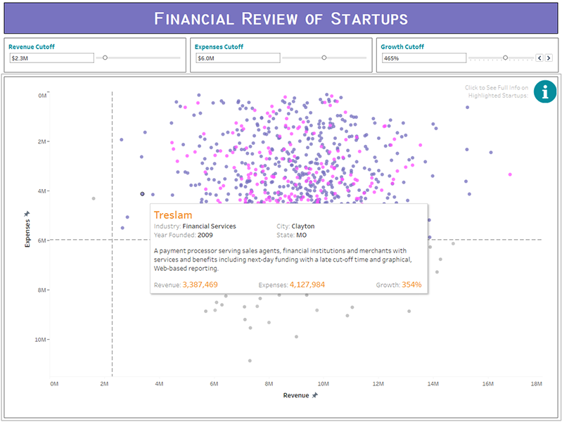
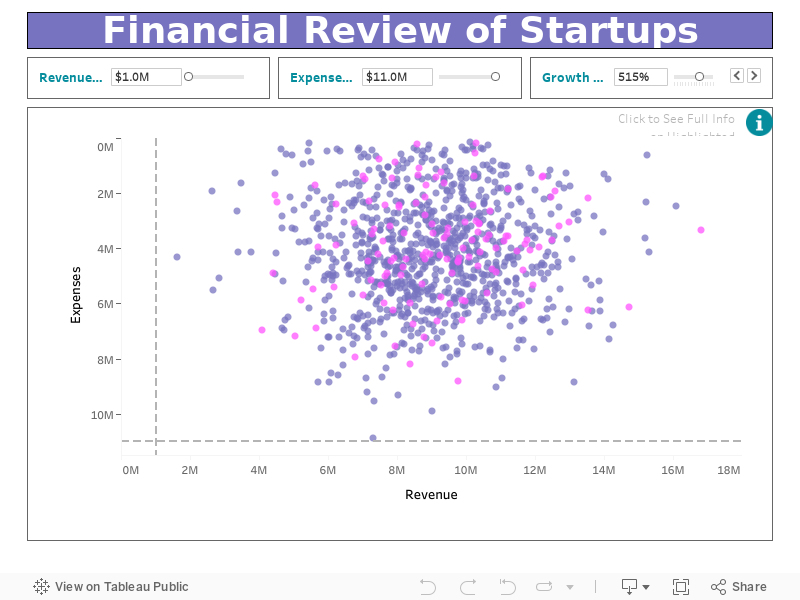
There are three parameter controls on this dashboard: Expenses Cutoff, Revenue Cutoff, & Growth Cutoff. Expense Cutoff controls the horizontal reference line and defines the maximum 2015 expenses a startup must have in order to be considered by the Board for investment. Revenue Cutoff controls the vertical reference line and defines the minimum 2015 revenue a startup must have to be considered. The purple data points are those startups that satisfy both requirements, i.e., those that are in the upper-right quadrant. This quadrant is defined as the Target Quadrant in the dashboard.
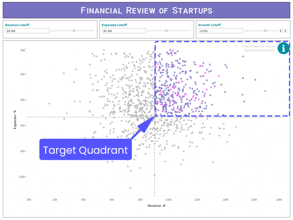
The Growth Cutoff parameter control defines the minimum 2015 growth rate a startup needs to have to be considered for investment. The pink data points are those startups that satisfy all three requirements (i.e, had a total expense less than the Expense Cutoff value, had a total profit more than the Revenue Cutoff value, and had a growth rate greater than the Growth Cutoff value).
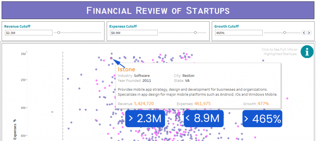
If a user would like to see more details about a particular startup, they can do that by selecting the startup in the scatter plot and clicking on the “Click Here to see…” link. Doing this will bring them to a table containing more information about the selected startup.
This also works if they would like to select multiple startups.
If instead the user only wants to see information on startups that are inside the target quadrant, they can do this quickly by clicking the  button on the top-right corner of the scatter plot. Doing this will bring them to a table containing a more detailed description of each startup in the target quadrant.
Room for Improvement:
The main thing I would like to work on is creating a mobile version of this dashboard. I would like to create a version that is optimized for mobile viewing. Unfortunately, I neither have a laptop nor a tablet, so this task is currently on hold.
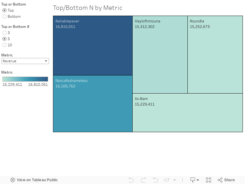
I would also like to implement a feature that would instantly filter the dashboard by top or bottom startups with respect to a specified metric. I’ve actually created a prototype using a different type of visualization. Check it out down below.
Click the link below to download the data used for this dashboard.
I highly suggest that you check out the dashboard on Tableau Public. Embedding a Tableau Dashboard into a WordPress blog is a bit tricky – the resolution tend to get out-of-control. By viewing the dashboard on Tableau Public, you’ll have a better chance of viewing it the way I intended it to be viewed. And again, currently it is not optimized for mobile devices. Please use a 1080p monitor or better.
To see my other dashboards and visualizations, click here to see my Tableau Public profile.