Predicting Used-Car Prices using Linear Regression
By Jeremiah Gerodias
The goal for this project is to build a Linear Regression model that could predict the price of a second-hand vehicle based on some of its specifications. This model will then be evaluated on how well it predicts the actual prices.
The dataset provided contains a list of real used-car sales records in the US. The following are descriptions of each column in the dataset.
- Brand - The make of the car (Toyota, Mercedes-Benz, Audi, ...)
- Price - The price in USD at which the car was sold
- Body - The car's body style (Sedan, Hatchback, Crossover, ...)
- EngineV - The engine volume / displacement in Liters
- Mileage - The car's mileage in thousands. A "0" mileage means the car was driven for less than a thousand miles
- EngineType - The type of the engine based on the fuel used. (Diesel, Petrol, Gas, ...)
- Registration - A yes/no value indicating whether the car had a valid registration at the time of the sale
- Year - The vehicles model year
- Model - The name of the car's model (RAV4, Camry, Jetta, ...)
Importing the Relevant libraries
import pandas as pd
import numpy as np
import matplotlib.pyplot as plt
import seaborn as sns
from math import ceil

import statsmodels.api as sm
from statsmodels.stats.outliers_influence import variance_inflation_factor

from sklearn.metrics import mean_squared_error, mean_absolute_error
from sklearn.linear_model import LinearRegression
from sklearn.model_selection import train_test_split
from sklearn.feature_selection import f_regression
from sklearn.preprocessing import StandardScaler

%matplotlib inline
sns.set(style = 'white')
Loading the Car_Sales.csv Dataset
Let's load the data into our Notebook and immediately make a copy. We will use the copy from this point on.
raw_data = pd.read_csv('Used_Car_Sales.csv')
data = raw_data.copy()
Quick Dataset Exploration
Let's take a look at the shape of our data set. We have 4,345 rows & 9 columns in our data set.
data.shape
Let's take a look at the first 5 rows of our data set to see what type values we have in each column. Specifically, I want to see how many numeric variables and how many categorical variables we have. It looks like we have 4 numeric variables (Price, Mileage, EngineV, and Year), and 5 categorical variables (Brand, Body, Engine Type, Registration, and Model).
data.head()
Let's take a look at the descriptive statistics of each of the column in the data set by running the following line of code. The first thing that stands out to me in following table is the count row. The numbers are not all the same; meaning that we have NULL values in our dataset. Specifically, it appears that we have NULL values in the Price and EngineV columns.
data.describe(include = 'all')
Removing NULL rows
The following heatmap shows where the NULL values are in our dataset. The yellow lines indicate a NULL value at the row specified on the y-axis. This heatmap confirms that we do in fact have NULL values in the Price and EngineV columns.
plt.figure(figsize = (7.5, 7.5))
plt.title('Missing Data Heatmap', fontsize = 18)
plt.xticks(fontsize = 15)
sns.heatmap(data.isnull(), cbar = False, cmap = 'gnuplot')
plt.show()

Let's see how many NULL values we have exactly. We have 172 NULL values under the Price column, and 150 NULL values under the EngineV column
data.isnull().sum()
Let's remove all the rows that have a NULL value in them by running the following line of code.
data = data.dropna()
Let's verify that all NULL values have been removed by counting the NULL values again. We see that now have "0" NULL values in our entire data set.
data.isnull().sum()
We can also see from the new heatmap that there are no more yellow lines in the heatmap; meaning that all NULL values have indeed been removed.
plt.figure(figsize = (7.5, 7.5))
plt.title('Missing Data Heatmap', fontsize = 18)
plt.xticks(fontsize = 15)
sns.heatmap(data.isnull(), cbar = False, cmap = 'gnuplot')
plt.show()

data_noNULL = data.copy()
Generating the rows_removed() function
I know we will be removing more rows in our dataset once we get to working with outliers. A good rule-of-thumb I like to follow is to not remove more than 5% of the dataset. I wrote a very simple function that will help us keep tabs on how many rows we've removed so far.
def rows_removed(data):
    print('Current # of rows: {}'.format(data.shape[0]))
    print('Total rows removed: {}'.format(raw_data.shape[0] - data.shape[0]))
    print('Total rows removed (%): {}'.format(round(100*(raw_data.shape[0] - data.shape[0])/raw_data.shape[0],2)))
rows_removed(data_noNULL)
Even though we've already violated the 5% rule, 7.36% is still acceptable considering that we've only removed the NULL values so far. Leaving them in would only cause more problems for us down the road.
Correcting Dubious EngineV Entries
As I was exploring this dataset, I noticed that there some questionable entries under the EngineV column. The following code displays the descriptive statistics of this column.
data_noNULL['EngineV'].describe()
We see that the maximum value in this column is 99.99... No car in existence has an engine volume this big. A common way to label missing values is by assigning "99.99". These values will be treated as such and will be removed from the dataset. The following line of code removes all records with a "99.99" EngineV
data_fixEngineV = data_noNULL[data_noNULL.EngineV != 99.99]
Another issue I realized is that some EngineV entries are higher than 10L. Commuter cars typically don't have engine volumes this big. As a comparison, monster trucks have engine volumes of up to 9.42L. The following table is a subset of the dataset containing records with EngineV greater than or equal to 10L.
data_fixEngineV[data_fixEngineV.EngineV >= 10]
I realized that since this is a real dataset, it is reasonable to believe that these high engine volumes could be a result of typing errors. More precisely, I believe that people who entered these values may have misplaced the decimal point. In the table above, the engine volume of a 2007 BMW X5 was recorded as 30.0L. However, a quick search on Google suggests that the car actually has a 3.0L engine.
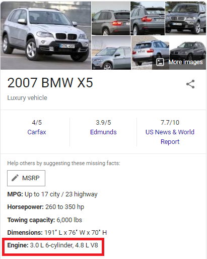 |  | 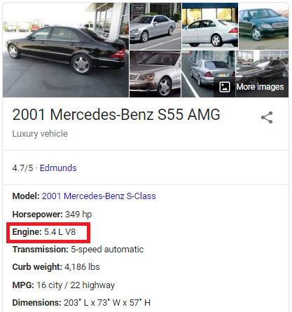 |
The recorded engine volume is 10x the car's actual engine volume. This is true for some of the cars in the table; not all. The recorded engine volume for a 2001 Mercedes-Benz S55 is 55.0L, but the actual engine volume is 5.4L.
These values will need to be corrected in some way before proceeding with the regression. I came up with three possible ways to do this:
- Trim all records that contain an EngineV >= 10
- Cross-reference another dataset containing accurate engine volume information on all vehicles (Ex: https://www.fueleconomy.gov/feg/epadata/vehicles.csv.zip).
- Divide by 10 all the entries that are >= 10.
I decided to go with the 3rd option for the following reasons:
- Simply removing these unusual entries would bring us farther from the 5% rule.
- Cross-referencing requires additional processing of both datasets (to make sure that matches are made).
- Dividing all entries that are greater than 10 is relatively easy to implement and requires no additional removal of records.
Even if the process of dividing these entries by 10 does not get us to the correct values, the results would at least be more realistic.
The following function checks each entry under the EngineV column and divides it by 10 if it is greater than or equal to 10.
def correct_mistyped_EngineV(x):
    if x > 10:
        return x/10
    else:
        return x
data_fixEngineV['EngineV'] = data_fixEngineV['EngineV'].apply(correct_mistyped_EngineV)
Note: You may be seeing a SettingWithCopyWarning. This is only a warning; the entries are corrected as intended.
All EngineV entries have now been corrected. We no longer have "99.99" values, and all values are now under 10.
data_fixEngineV['EngineV'].describe()
Here's a quick check of how many records have been removed so far.
rows_removed(data_fixEngineV)
Only an additional 0.17% (7 more rows) have been removed.
OLS Assumption: No Multicollinearity
We first need to explore some of the OLS assumptions before proceeding with any regression. The first assumption we'll explore is the assumption of No Multicollinearity. Here I generated three scatter plots showing the relationships between the three numerical independent variables: Mileage, EngineV, and Year.
fig, (ax1, ax2, ax3) = plt.subplots(nrows = 1, ncols = 3, tight_layout = True, figsize = (15,6))
ax1.set_title('Mileage v EngineV', fontsize = 18)
sns.scatterplot(y = data_fixEngineV.Mileage, x = data_fixEngineV.EngineV, alpha = 0.6, color = 'tab:purple', ax = ax1)
ax2.set_title('Mileage v Year', fontsize = 18)
sns.scatterplot(y = data_fixEngineV.Mileage, x = data_fixEngineV.Year, alpha = 0.6, color = 'tab:brown', ax = ax2)
ax3.set_title('EngineV v Year', fontsize = 18)
sns.scatterplot(y = data_fixEngineV.EngineV, x = data_fixEngineV.Year, alpha = 0.6, color = 'tab:cyan', ax = ax3)
plt.show()

Another way of exploring the relationship between the independent variables is to create what's called a correlation heatmap. A correlation heatmap, like the one below, describes the same relationship apparent in the three scatterplots above.
plt.figure(figsize = (10.5,7.5), tight_layout = True)
plt.title('Correlation Heatmap', fontsize = 18)
corr = data_fixEngineV[['Mileage','EngineV','Year']].corr()
mask = np.triu(np.ones_like(corr, dtype=np.bool))
cmap = sns.diverging_palette(10, 220, as_cmap=True)

sns.heatmap(corr,
            cmap = cmap,
            mask = mask,
            center = 0,
            vmax = 1,
            vmin = -1,
            square = True,
            linewidths = 0.5,
            cbar_kws={"shrink": 0.6},
            annot = True,
)
plt.show()

Note: Depending on your version of matplotlib, the correlation heatmap above may appear cutoff on the top and bottom. This is a known issue in 3.1.1. Upgrade to version 3.1.2 or higher to see the visualization as intended
Looking at the heatmap and the scatterplots, it appears that there is some negative correlation between Year and Mileage. To verify this, I calculated the Variance Inflation Factors (VIF). The VIF quantifies the effect of multicollinearity on the variances of the regression coefficients. The higher the VIF for a particular variable, the more likely that this variable is correlated with the other variables.
A rule-of-thumb commonly followed in practice is that if the VIF > 5, then that predictor is significantly correlated with the other variables. Removing it from the regression should be seriously considered. There are cases where a high VIF can be safely ignored, but those cases don't apply in our situation.
variables = data_fixEngineV[['Mileage', 'EngineV', 'Year']]
vif_df = pd.DataFrame(variables.columns.values, columns = ['Feature'])
vif_df['VIF'] = [variance_inflation_factor(variables.values, i) for i in range(variables.shape[1])]
vif_df
Dropping Year
The VIF values for EngineV and Year supports the idea that these predictors may be correlated. One of these two needs to be dropped from our dataset. I decided to drop Year simply because it has a higher VIF value than EngineV.
data_noYear = data_fixEngineV.drop('Year', axis = 1)
OLS Assumption: Linearity
The next OLS assumption we'll explore is the assumption of Linearity. I generated these three scatterplots to visualize the relationship of the dependent variable, Price, with each of the numerical independent variable, Mileage and Year.
fig, (ax1, ax2) = plt.subplots(nrows = 1, ncols = 2, tight_layout = True, figsize = (15, 6), sharey = True)
ax1.set_title('Price v Mileage', fontsize = 18)
ax1.set_ylabel('Price', fontsize = 15)
sns.scatterplot(x = data_noYear.Mileage, y = data_noYear.Price, color = 'tab:orange', ax= ax1, alpha = 0.6)
ax1.set_xlabel('Mileage', fontsize = 15)
ax2.set_title('Price v EngineV', fontsize = 18)
sns.scatterplot(x = data_noYear.EngineV, y = data_noYear.Price, color = 'tab:green', ax = ax2, alpha = 0.6)
ax2.set_xlabel('EngineV', fontsize = 15)
plt.show()

Transforming Price
We can spot patterns in these scatterplots but definitely not linear ones. We cannot run a regression in this case. In order to proceed with the regression, we first need to transform one or more variables. Here I did a log-transformation on Price and re-created the same scatterplots with logPrice on the y-axis instead of Price.
data_noYear['logPrice'] = np.log(data_noYear.Price)
data_noYear.drop('Price', axis = 1, inplace = True)
fig, (ax1, ax2) = plt.subplots(nrows = 1, ncols = 2, tight_layout = True, figsize = (15, 6), sharey = True)
sns.scatterplot(x = data_noYear.Mileage, y = data_noYear.logPrice, color = 'tab:orange', ax= ax1, alpha = 0.6)
ax1.set_title('logPrice v Mileage', fontsize = 18)
ax1.set_ylabel('logPrice', fontsize = 15)
ax1.set_xlabel('Mileage', fontsize = 15)
sns.scatterplot(x = data_noYear.EngineV, y = data_noYear.logPrice, color = 'tab:green', ax = ax2, alpha = 0.6)
ax2.set_title('logPrice v EngineV', fontsize = 18)
ax2.set_xlabel('EngineV', fontsize = 15)
plt.show()

Transforming EngineV
The relationships definitely look more linear than before. Let's transform EngineV as well to compress the relationship slightly.
data_noYear['logEngineV'] = np.log(data_noYear.EngineV)
data_noYear.drop('EngineV', axis = 1, inplace = True)
fig, (ax1, ax2) = plt.subplots(nrows = 1, ncols = 2, tight_layout = True, figsize = (15, 6), sharey = True)
sns.scatterplot(x = data_noYear.Mileage, y = data_noYear.logPrice, color = 'tab:orange', ax= ax1, alpha = 0.6)
ax1.set_title('logPrice v Mileage', fontsize = 18)
ax1.set_ylabel('logPrice', fontsize = 15)
ax1.set_xlabel('Mileage', fontsize = 15)
sns.scatterplot(x = data_noYear.logEngineV, y = data_noYear.logPrice, color = 'tab:green', ax = ax2, alpha = 0.6)
ax2.set_title('logPrice v logEngineV', fontsize = 18)
ax2.set_xlabel('logEngineV', fontsize = 15)
plt.show()

Transforming Mileage
I think it will be a great idea to log-transform Mileage as well. However, this wouldn't be possible because there are "0" values (corresponding to less than 1,000 miles). We'll leave Mileage as-is and proceed to exploring the other OLS assumptions.
data_transformed = data_noYear.copy()
The Other OLS Assumptions
Let's discuss the remaining OLS assumptions:
- No Endogeneity - Admittedly, I don't have the domain knowledge required to say whether ommitted variable bias exists or not. For now, I'll assume that this assumption holds.
- No Autocorrelation - This will not be an issue since we are not dealing with time-series or panel data.
- Zero Mean of the Error Term - This won't be a concern since we'll be including the constant constant term in our regression.
- Homoscedasticity of the Error Term - This assumption will be explored later on once we generate the residuals plots.
- Normality of the Error Term - Not an issue since we have a relatively large dataset. Normality is assumed for a big sample (>= 30 observations) following the Central Limit Theorem.
Dealing with Outliers
I generated the three box-and-whiskers plots below to help us visualize the state of our outliers. Seaborn determines outliers based on the interquartile range (IQR). By default, Seaborn classifies any point above or below 1.5*IQR as outliers.
fig, (ax1, ax2, ax3) = plt.subplots(nrows = 1, ncols = 3, tight_layout = True, figsize = (15, 6))
sns.boxplot(y = data_transformed.logPrice, ax = ax1, color = 'tab:blue')
ax1.set_title('logPrice', fontsize = 18)
ax1.set_ylabel(None)
sns.boxplot(y = data_transformed.Mileage, ax = ax2, color = 'tab:orange')
ax2.set_title('Mileage', fontsize = 18)
ax2.set_ylabel(None)
sns.boxplot(y = data_transformed.logEngineV, ax = ax3, color = 'tab:green')
ax3.set_title('logEngineV', fontsize = 18)
ax3.set_ylabel(None)
plt.show()

Counting the Outliers
The box plots above help us visualize the range of the outliers. What these plots don't tell us is how many outliers there are. The following lines of code counts the total number of outliers in each of the three variables.
df = data_transformed[['logPrice','Mileage','logEngineV']]
q3, q1 = df.quantile(0.75), df.quantile(0.25),
iqr = q3-q1
maxm, minm = q3 + 1.5*iqr, q1 - 1.5*iqr

print(((df < minm) | (df > (maxm))).sum())
There are 63 outliers in logPrice, 36 in Mileage, and 9 in logEngineV
Removing the Outliers
The following line of code removes these outliers from the dataset. It uses the same minm and maxm variables from before, with minm = q1 - 1.5 iqr and maxm = q3 + 1.5 iqr
data_noOL = data_transformed[~((data_transformed < minm) | (data_transformed > maxm)).any(axis=1)]
To verify that all outliers have been removed, let's re-count the outliers.
df = data_noOL[['logPrice','Mileage','logEngineV']]
print(((df < minm) | (df > (maxm))).sum())
All outliers are gone as expected! Let's generate the new boxplots to see the difference.
fig, (ax1, ax2, ax3) = plt.subplots(nrows = 1, ncols = 3, tight_layout = True, figsize = (15, 6))
sns.boxplot(y = data_noOL.logPrice, ax = ax1, color = 'tab:blue')
ax1.set_title('logPrice', fontsize = 18)
ax1.set_ylabel(None)
sns.boxplot(y = data_noOL.Mileage, ax = ax2, color = 'tab:orange')
ax2.set_title('Mileage', fontsize = 18)
ax2.set_ylabel(None)
sns.boxplot(y = data_noOL.logEngineV, ax = ax3, color = 'tab:green')
ax3.set_title('logEngineV', fontsize = 18)
ax3.set_ylabel(None)
plt.show()

Note: The outliers displayed in these new boxplots are the outliers relative to the new data_noOL data variable. All outliers from data_transformed have been removed.
To wrap-up this section, let's see how many rows we have removed so far.
rows_removed(data_noOL)
Yikes... That is a 2.48% increase (108 rows removed) from before! It is certainly worth exploring other ways to deal with outliers that require little no additional removal of data. For now, however, we'll put this task aside and proceed with feature scaling.
Feature Scaling
Let's take a look at our numerical features and take note of the difference in magnitudes.
data_unscaled = data_noOL.copy()
data_unscaled[['Mileage','logEngineV']].describe()
Most of the Mileage values are in the hundreds, while the logEngineV values are between 0 and 1.841. In order for our regression to treat these two features equally, we need to transform our data into a standard scale. Here I used the StandardScaler module from sklearn to do the standardization.
scaler = StandardScaler()
x = data_unscaled[['Mileage','logEngineV']]
scaler.fit(x)
x_scaled = scaler.transform(x)

data_scaled = data_unscaled.copy()
data_scaled[['Mileage','logEngineV']] = x_scaled
Both Mileage and logEngineV have now been transformed into a standard scale. Let's see how these two features look now.
pd.set_option('display.float_format', '{:.3f}'.format)
data_scaled[['Mileage','logEngineV']].describe()
Great! Both features are now similar in magnitude. We are now done pre-processing our numerical data. The next step is to explore our categorical data. Specifically, we now have to convert our categorical data into numerical data for them to be included in the regression. We do this by creating dummy variables.
Generating Dummy Variables
Dropping Model
Let's take a look at all our categorical data: Brand, Body, Engine Type, Registration, and Model.
data_scaled.describe(exclude = [np.number])
We see that there are 293 unique entries under Model. We'll drop this column from our dataset as we'll see later on how this big of a number can be a problem.
data_scaled = data_scaled.drop('Model', axis = 1)
Creating the Dummy Variables with get_dummies
Pandas has a great method called get_dummies() that spots all the categorical variables in a data frame and automatically creates dummy variables for each of them. An important note to know is that if we have N number of categories for a feature, we need to create N - 1 dummies to avoid re-introducing multicollinearity to our regression. The drop_first = True argument takes care of this for us.
data_dummies = pd.get_dummies(data_scaled, drop_first = True)
data_dummies.head()
The dummy variables have now been created! Our dataset has become wider as a result. If we had kept Model, this dataset will be 292 columns wider! Another thing to note is that if we allowed both Brand and Model to exist in our dataset, multicollinearity will be re-introduced as there is surely a relationship between car's make and its model (ex. a Passat is obviously going to be a Volkswagen).
The following code allows us to see which categories were dropped by the drop_first = True argument from each feature. These categories are also called the reference categories. For example, if all Brand_ columns are 0, then the car is an Audi. If all Body_ columns are 0, then the car has a crossover body type.
reference_categories = pd.DataFrame({'Variable':['Brand','Body','Engine Type','Registration']})
reference_categories['Reference Category'] = [np.sort(data_noOL[i].unique())[0] for i in reference_categories['Variable'].values]
reference_categories
Our Pre-Processed Data
We are now done with pre-processing our data! We can now proceed with building our regression. Let's take a look at the final state of our dataset.
processed_data = data_dummies.copy()
processed_data.head(15)
Multicollinearity Check
plt.figure(figsize = (15, 6), tight_layout = True)
plt.title('Mileage v logEngineV', fontsize = 18)
plt.xlabel('logEngineV', fontsize = 15)
plt.ylabel('Mileage', fontsize = 15)
sns.scatterplot(x = processed_data.logEngineV, y = processed_data.Mileage, color = 'tab:purple', alpha = 0.4)
plt.show()

Linearity Check
fig, (ax1, ax2) = plt.subplots(nrows = 1, ncols = 2, tight_layout = True, figsize = (15,6), sharey = True)
sns.scatterplot(x = processed_data.Mileage, y = processed_data.logPrice, color = 'tab:orange', alpha = 0.4, ax = ax1)
ax1.set_title('logPrice v Mileage', fontsize = 18)
ax1.set_ylabel('logPrice', fontsize = 15)
ax1.set_xlabel('Mileage', fontsize = 15)
sns.scatterplot(x = processed_data.logEngineV, y = processed_data.logPrice, color = 'tab:green', alpha = 0.4, ax = ax2)
ax2.set_title('logPrice v logEngineV', fontsize = 18)
ax2.set_xlabel('logEngineV', fontsize = 15)
plt.show()

Distribution of Numerical Data
fig, (ax1, ax2, ax3) = plt.subplots(nrows = 1, ncols = 3, tight_layout = True, figsize = (15, 6))
sns.distplot(processed_data.logPrice, ax = ax1, color = 'tab:blue')
ax1.set_title('logPrice', fontsize = 18)
ax1.set_xlabel(None)
sns.distplot(processed_data.Mileage, ax = ax2, color = 'tab:orange')
ax2.set_title('Mileage', fontsize = 18)
ax2.set_xlabel(None)
sns.distplot(processed_data.logEngineV, ax = ax3, color = 'tab:green')
ax3.set_title('logEngineV', fontsize = 18)
ax3.set_xlabel(None)
plt.show()

State of outliers
fig, (ax1, ax2, ax3) = plt.subplots(nrows = 1, ncols = 3, tight_layout = True, figsize = (15, 6))
sns.boxplot(y = processed_data.logPrice, ax = ax1, color = 'tab:blue')
ax1.set_title('logPrice', fontsize = 18)
ax1.set_ylabel(None)
sns.boxplot(y = processed_data.Mileage, ax = ax2, color = 'tab:orange')
ax2.set_title('Mileage', fontsize = 18)
ax2.set_ylabel(None)
sns.boxplot(y = processed_data.logEngineV, ax = ax3, color = 'tab:green')
ax3.set_title('logEngineV', fontsize = 18)
ax3.set_ylabel(None)
plt.show()

Total Rows Removed
rows_removed(processed_data)
Declaring the Target and the Predictors
The first thing we'll need to do is to declare which variable are we trying to predict (the target), and which variables are we using to make the predictions (the predictors). The target in our case is logPrice; everything else will be the predictors.
y = processed_data['logPrice']
x = processed_data.drop('logPrice', axis =1)
Train-Test Split
Since we were only given one dataset to work with, we'll be splitting this dataset into a training set and a testing set. 80% of the data will be used for training/building the model while the other 20% will be used for testing the model. Here I used sklearn's train_test_split module to split the data randomly.
x_train, x_test, y_train, y_test = train_test_split(x, y, test_size = 0.2, random_state = 42)
Building the Model
Two commonly used libraries for building regressions are statsmodels and sklearn. For demonstration, I will be using both libraries to generate the same regression model.
Using statsmodels
x_train_df = pd.DataFrame(x_train, columns = x.columns.values)
X_train = sm.add_constant(x_train_df)
sm_model = sm.OLS(y_train,X_train).fit()
print(sm_model.summary())
One advantage statsmodels has over sklearn is that it produces this neat table that summarizes the result of the regression. Let's make sense of this table by interpreting some of the numbers we see.
R-squared (0.734) and Adj. R-squared (0.732):
Since we're doing a multiple linear regression, it makes much more sense to look at the Adjusted R-squared instead of the R-squared. An Adj. R-squared value of 0.732 means that around 73% of the variance in logPrice is explained by our model. It is definitely not a bad number, but it certainly could be better.
F-statistic (503.9) & Prob (F-statistic) (0.00):
These numbers tell us the overall significance of our model. The higher the F-statistic is, the better. The lower the Prob (F-statistic) is, the better. The null hypothesis being tested here is that all coefficients are equal to zero. Our numbers tell us that our model is significant at all significance levels.
coef:
These are the coefficients of our model. A brief interpretation of these coefficients is that if all other variables are held constant, a 1 unit increase in Mileage corresponds to a 0.4571% decreases in a car's Price.
Using sklearn
model = LinearRegression().fit(x_train, y_train)
Some of the numbers we see in the statsmodels table above are difficult to re-create in sklearn. It does have a method for calculating the R-squared but it doesn't have a straightforward way of calculating the Adjusted R-squared. sklearn also does not have a direct method to calculate the F-statistic.
We'll use sklearn's score() method to calculate the R-squared, and then use that R-squared value to manually calculate the Adjusted R-squared. We'll also use the coef_ method to gather all the coefficients, and the intercept_ method to determine the constant term.
R2 = round(model.score(x_train, y_train), 3)
R2_adj = round(1 - (1-R2)*(len(y_train)-1)/(len(y_train)-x_train.shape[1]-1),3)
intercept = model.intercept_.round(4)
coeff = model.coef_.round(4)
R = pd.DataFrame({'Metric':['R-squared','Adj. R-squared'], 'Score': [R2, R2_adj]})
R
weights = pd.DataFrame({'Parameter': np.append('const', x.columns.values), 'Coef': np.append(intercept, coeff)})
weights
Great! We can see that all numbers are identical to the OLS results using statsmodels. We now have our linear regression model. We will now evaluate this using a number of visualizations.
Evaluating the Model (Training Data)
Here we are using our model to make some predictions using the same data set we trained our model on.
y_hat_train = model.predict(x_train)
I prepared a data frame comparing the predicted values and observed values. Residual is calculated as Predicted - Observed. Abs. Error is simply the absolute value of the Residual.
eval_df_train = pd.DataFrame({'Predicted': y_hat_train,
                              'Observed': y_train,
                              'Residual': y_hat_train - y_train,
                              'Abs. Error': np.abs(y_hat_train - y_train)
                             }
)
eval_df_train.head(8)
Let's take a look at the descriptives. We can see the mean Residual is 0.000 (1.02e-15). That's great! This means that on average, the difference between our predicted values and the observed values is roughly zero. The Mean Absolute Error (MAE) is only 0.324.
pd.set_option('display.float_format', '{:.3f}'.format)
eval_df_train.describe()
eval_df_train['Residual'].mean()
In addition to the R-squared, the Adjusted R-squared values, and the Mean Absolute Error, I will also include the Root Mean Squared Error (RMSE) to help us evaluate our model. We'd want both the MAE and the RMSE to be as low as possible. So far, our numbers our telling us that we have a relatively good model
MAE = mean_absolute_error(y_train, y_hat_train)
RMSE = np.sqrt(mean_squared_error(y_train, y_hat_train))
metrics_train = pd.DataFrame({'Metric': ['R-squared', 'Adj. R-squared', 'MAE', 'RMSE'],
                        'Score': [R2, R2_adj, MAE, RMSE]})
metrics_train
Let's generate some visualizations to help us understand our model even more. The following is a scatter plot of the predicted values on the y-axis and the observed values on the x-axis. Ideally, we would want the points to form along a 45-degree line.
plt.figure(figsize = (7.5,7.5), tight_layout = True)
sns.scatterplot(x = y_train, y = y_hat_train, alpha = 0.4, color = 'tab:blue')
plt.xlabel('Observed logPrice', fontsize = 15)
plt.ylabel('Predicted logPrice', fontsize = 15)
plt.xlim(7,12)
plt.ylim(7,12)
plt.title('Predicted v Observed (Training Data)', fontsize = 18)
plt.plot([0, 12], [0, 12], color = 'tomato', ls = '--', lw = 2, label = '45-deg line')
plt.legend(fontsize = 15)
plt.show()

Looking at this plot, we can make the following observations:
- Most points do form along this 45-degree line.
- The points tend to be more scattered in the lower price range (Observed logPrice < 9).
- Some of the over-predictions in the lower price range are quite large.
- The model almost always under-predict in the higher price range (Observed logPrice > 11).
- The model tend to perform really well in the middle price range (9 < Observed logPrice < 11).
- We don't have a lot of data in the lower and higher prices ranges.
- Our model tend to underpredict overall.
The following is a scatterplot of the Absolute Error vs the Observed logPrice. The plot supports some of the observations we made.
plt.figure(figsize = (7.5,7.5), tight_layout = True)
sns.scatterplot(x = y_train, y = eval_df_train['Abs. Error'], alpha = 0.4, color = 'tab:blue')
plt.axvline(x = 11, ls = '--', lw = 2, color = 'tomato', label = '11')
plt.axvline(x = 9, ls = '--', lw = 2, color = 'tomato', label = '9')
plt.title('Absolute Error v Observed logPrice (Training Data)', fontsize = 18)
plt.xlabel('Observed logPrice', fontsize = 15)
plt.ylabel('Absolute Error', fontsize = 15)
plt.xlim(7,12)
plt.show()

It appears that we can essentially split our data into three bins: cars that have a logPrice less than 9, cars that have a logPrice between 9 and 11, and cars that have a logPrice greater than 11. Let's examine these bins by looking at some of the descriptive statistics.
bins_train = pd.DataFrame({'Observed_logPrice': y_train,
                        'Residual': eval_df_train.Residual,
                        'Abs. Error': eval_df_train['Abs. Error']})
bins_train_desc = bins_train.groupby(pd.cut(bins_train.Observed_logPrice, [7,9,11,12])).agg(count = ('Residual', 'count'),
                                                                                            mean_Residual = ('Residual', np.mean),
                                                                                            max_Residual = ('Residual', 'max'),
                                                                                            mean_AbsError = ('Abs. Error', np.mean),
                                                                                            max_AbsError = ('Abs. Error', 'max'))
bins_train_desc
The resulting table supports the observations we made earlier. Most of the cars in our data are in fact in the middle price range. The mean Residual in the lower price range is a positive number; meaning that our model tend to over-predict in this range. Our model tend to under-predict in the middle and higher price ranges based on the negative signs of the mean_Residual. All predictions in the higher price range are under-predictions based on the sign of the max_Residual. Our model tend to do really well in the middle price range based on the value of the mean_AbsError. Finally, our largest mis-prediction happened in the lower price range based on the value of the max_AbsError.
The following is a distribution plot of the the Residuals. We can see that the Residuals are centered around zero. This confirms our finding about the mean Residual value earlier. However, we can also notice that the plot is right-skewed. This verifies observations #3 and #6.
plt.figure(figsize = (7.5, 7.5), tight_layout = True)
plt.title('Residuals Distribution (Training Data)', fontsize = 18)
plt.xlabel('Residual', fontsize = 15)
sns.distplot(eval_df_train.Residual, color = 'tab:blue')
plt.axvline(x = 0, ls = '--', lw = 2, color = 'tomato', label = 'Zero')
plt.legend(fontsize = 15)
plt.show()

The following plot is a traditional Residuals plot. The Residuals are plotted on the y-axis while the Predicted values are plotted on the x-axis. Ideally, we would want the points to form a rectangular shape. It is clear, however, that our points form more of a cone instead. This indicates a heteroscadisticity of the error term. It looks like a linear regression model isn't ideal after all! Well, since we've already gone this far, let's proceed anyway. Perhaps we can do something later on that would that would allow us to avoid violating this OLS assumption.
plt.figure(figsize = (7.5, 7.5), tight_layout = True)
plt.title('Residuals Plot (Training Data)', fontsize = 18)
plt.xlabel('Predicted logPrice', fontsize = 15)
plt.ylabel('Residual', fontsize = 15)
sns.scatterplot(x = y_hat_train, y = eval_df_train.Residual, alpha = 0.4, color = 'tab:blue')
plt.axhline(y = 0, ls = '--', lw = 2, color = 'tomato', label = 'Zero')
plt.legend(fontsize = 15, loc = 'upper left')
plt.show()

Testing the Model
Now that we have thoroughly described our model, it is time to use it on the testing data! Let's see if the observations we made still hold. First we'll use our model to make predictions on the test data. We will then generate the same tables and scatterplots from before and compare the results.
Making Predictions
y_hat = model.predict(x_test)
Evaluating the Results
The descriptives are very similar to the descriptives from the training data. The main difference I can see is the value of the mean_Residual. Earlier, we had a mean_Residual of 0.000. With the testing data, we found our mean Residual to be 0.013. This quite a large number relative to the previous value, but still a small number overall.
eval_df = pd.DataFrame({'Predicted': y_hat,
                        'Observed': y_test,
                        'Residual': y_hat - y_test,
                        'Abs. Error': np.abs(y_hat - y_test)})
eval_df.describe()
Let's now compare R-squared, Adjusted R-squared, MAE, and RMSE. We see that the numbers are all very similar. In general, since the model is working on unfamiliar data, we expect the R values to be smaller than before and the Error values to be larger. That seems to be the case here with the exception of the MAE value. The MAE with test data is 0.006 smaller than before. This difference, however, is still very trivial and so we won't dwell too much on it.
R2 = model.score(x_test, y_test)
R2_adj = 1 - (1-R2)*(len(y_test)-1)/(len(y_test)-x_test.shape[1]-1)
MAE = mean_absolute_error(y_test, y_hat)
RMSE = np.sqrt(mean_squared_error(y_test, y_hat))

metrics = pd.DataFrame({'Metric': ['R-squared', 'Adj. R-squared', 'MAE', 'RMSE'],
                        'Score': [R2, R2_adj, MAE, RMSE]})
metrics
The "45-degree" plot is similar to the one we got earlier. We can see the same oberservations as before. The "Absolute Error v Observed logPrice" plot is very similar to the one before as well.
plt.figure(figsize = (7.5, 7.5), tight_layout = True)
sns.scatterplot(x = y_test, y = y_hat, alpha = 0.4, color = 'tab:green')
plt.xlabel('Observed logPrice', fontsize = 15)
plt.ylabel('Predicted logPrice', fontsize = 15)
plt.xlim(7,12)
plt.ylim(7,12)
plt.title('Predicted v Observed (Test Data)', fontsize = 18)
plt.plot([0, 12], [0, 12], color = 'tomato', ls = '--', lw = 2, label = '45-deg line')
plt.legend(fontsize = 15)
plt.show()

plt.figure(figsize = (7.5,7.5), tight_layout = True)
sns.scatterplot(x = y_test, y = eval_df['Abs. Error'], alpha = 0.4, color = 'tab:green')
plt.axvline(x = 11, ls = '--', lw = 2, color = 'tomato', label = '11')
plt.axvline(x = 9, ls = '--', lw = 2, color = 'tomato', label = '9')
plt.title('Absolute Error v Observed logPrice (Test Data)', fontsize = 18)
plt.xlabel('Observed logPrice', fontsize = 15)
plt.ylabel('Absolute Error', fontsize = 15)
plt.xlim(7,12)
plt.show()

The descriptives of the three bins we defined earlier are also similar. The most noticeable difference is the sign of the max_Residual for the higher price range. We had a negative max_Residual before; the sign this time is positive. This means that there is at least one instance where our model over-predicted in the higher price range.
bins = pd.DataFrame({'Observed_logPrice': y_test,
                     'Residual': eval_df.Residual,
                     'Abs. Error': eval_df['Abs. Error']})
bins_desc = bins.groupby(pd.cut(bins.Observed_logPrice, [7,9,11,12])).agg(count = ('Residual', 'count'),
                                                                          mean_Residual = ('Residual', np.mean),
                                                                          max_Residual = ('Residual', 'max'),
                                                                          mean_AbsError = ('Abs. Error', np.mean),
                                                                          max_AbsError = ('Abs. Error', 'max'))
bins_desc
The "Residual Distribution" plot is also very similar to the one we got earlier as well. Here we still see that the Residuals are generally centered around zero, and that the distribution is right-skewed.
plt.figure(figsize = (7.5, 7.5), tight_layout = True)
plt.title('Residuals Distribution (Test Data)', fontsize = 18)
plt.xlabel('Residual', fontsize = 15)
sns.distplot(eval_df.Residual, color = 'tab:green')
plt.axvline(x = 0, ls = '--', lw = 2, color = 'tomato', label = 'Zero')
plt.legend(fontsize = 15)
plt.show()

Looking at the new "Residuals" plot, we see that we still have the same cone shape.
plt.figure(figsize = (7.5, 7.5), tight_layout = True)
plt.title('Residuals Plot (Test Data)', fontsize = 18)
plt.xlabel('Predicted logPrice', fontsize = 15)
plt.ylabel('Residual', fontsize = 15)
plt.ylim(-3,3)
sns.scatterplot(x = y_hat, y = eval_df.Residual, alpha = 0.4, color = 'tab:green')
plt.axhline(y = 0, ls = '--', lw = 2, color = 'tomato', label = 'Zero')
plt.legend(fontsize = 15)
plt.show()

Summary of the Test
In summary, our model performed similary on test data as it did with the training data. There doesn't seem to be a major drop in performance based on the metrics we calculated (R-squared, Adj. R-squared, MAE, and RMSE). We can still say that our model performs best when predicting cars with an observed logPrice between 9 and 11. In addition, the same issue of non-homoscedastic and non-normal residuals is still present in the test data. As I mentioned before, a linear model may not be the best approach after all.
Profiles of the Lower-Priced, Mid-Range, and Higher-Priced Cars
Before we wrap-up this project, let's take a look one last time at the three Observed logPrice bins we mentioned: (7, 9], (9, 11], and (11, 12]. Let's make it easier for us to interpret the following analysis by taking the exponentials. We'll convert logPrice back into US Dollar values:
(\$0, \\$8104], (\$8104, \\$59875], and (\$59875, inf)
e9 = np.exp(9)
e11 = np.exp(11)

print('e9 = $ {:,}'.format(ceil(e9)))
print('e11 = $ {:,}'.format(ceil(e11)))
Besides the prices, let's see if we could find similarities in the cars within each of these bins. Hopefully by doing so we'll have a better understanding of where our model shines and where it does not.
We've mentioned before that our models perform well in predicting prices for mid-priced cars. Let's see how these cars differ from low-priced and high-priced cars.
profile = data_fixEngineV.copy()
profile['Price_Range'] = np.where(profile.Price <= e9, 'Low', np.where(profile.Price > e11, 'High', 'Mid'))
Difference in Mileage
We see that Mileage for lower-priced cars are typically around 220k miles while higher-priced cars are almost all under 1k miles. Mid-range cars typically have Mileage around 170k.
plt.figure(tight_layout = True, figsize = (7.5,7.5))
sns.boxplot(x = profile.Price_Range, y = profile.Mileage)
plt.title('Difference in Mileage Distribution by Price Range', fontsize = 15)
plt.xlabel('Price Range', fontsize = 15)
plt.show()

plt.figure(tight_layout = True, figsize = (7.5,7.5))
sns.distplot(profile[profile.Price_Range == 'Low'].Mileage, label = 'Low', hist = False)
sns.distplot(profile[profile.Price_Range == 'Mid'].Mileage, label = 'Mid', hist = False)
sns.distplot(profile[profile.Price_Range == 'High'].Mileage, label = 'High', hist = False)
plt.legend(fontsize = 13)
plt.title('Difference in Mileage Distribution by Price Range', fontsize = 15)
plt.xlabel('Mileage', fontsize = 15)
plt.show()

Difference in Year
We ended up removing Year in our dataset but I believe it's still worth to look at the differences. We can see that higher-priced cars are relatively newer. Almost all cars in this range are 2016 models. Lower-priced cars, on the other hand, are typically have 2000 model cars. Middle-priced car are mostly between 2008 to 2011 models.
plt.figure(tight_layout = True, figsize = (7.5,7.5))
sns.boxplot(x = profile.Price_Range, y = profile.Year)
plt.title('Difference in Year Distribution by Price Range', fontsize = 15)
plt.xlabel('Price Range', fontsize = 15)
plt.show()

plt.figure(tight_layout = True, figsize = (7.5,7.5))
sns.distplot(profile[profile.Price_Range == 'Low'].Year, label = 'Low', hist = False)
sns.distplot(profile[profile.Price_Range == 'Mid'].Year, label = 'Mid', hist = False)
sns.distplot(profile[profile.Price_Range == 'High'].Year, label = 'High', hist = False)
plt.legend(fontsize = 13)
plt.title('Difference in Year Distribution by Price Range', fontsize = 15)
plt.xlabel('Year', fontsize = 15)
plt.show()

Difference in Engine Volume
We saw a pretty stark difference between the three price ranges in the previous comparisons. It was easy to differentiate a mid-priced cars from lower-priced and higher-priced cars. When it comes to comparing the Engine Volumes, however, differentiating lower-priced cars from mid-priced cars is a little challenging. Engine Volumes of lower-priced and mid-priced cars blend around 1.5L to 2.2L. Higher-priced cars have a wider range of Engine Volumes but most of them are larger than 2.2L.
plt.figure(tight_layout = True, figsize = (7.5,7.5))
sns.boxplot(x = profile.Price_Range, y = profile.EngineV)
plt.title('Difference in Engine Volume Distribution by Price Range', fontsize = 15)
plt.xlabel('Price Range', fontsize = 15)
plt.show()

plt.figure(tight_layout = True, figsize = (7.5,7.5))
sns.distplot(profile[profile.Price_Range == 'Low'].EngineV, label = 'Low', hist = False)
sns.distplot(profile[profile.Price_Range == 'Mid'].EngineV, label = 'Mid', hist = False)
sns.distplot(profile[profile.Price_Range == 'High'].EngineV, label = 'High', hist = False)
plt.legend(fontsize = 13)
plt.title('Difference in Engine Volume Distribution by Price Range', fontsize = 15)
plt.xlabel('EngineV', fontsize = 15)
plt.show()

Difference in Car Makes
Most of the cars in the mid-priced range are Volkswagens, Mercedes-Benz's, and Toyotas. Lower-priced cars are generally Volkswagens, Renaults, and Mercedes-Benz's. Finally, higher-priced cars are mostly Mercedes-Benz's, BMWs, and Toyotas.
plt.figure(tight_layout = True, figsize = (7.5,7.5))
sns.countplot(x = profile.Price_Range, hue = profile.Brand)
plt.legend(fontsize = 13)
plt.title('Counts of Brands by Price Range', fontsize = 15)
plt.xlabel('Price Range', fontsize = 15)
plt.show()

Difference in Body Types
Mid-priced cars are mostly sedans and crossovers. Higher-priced cars are almost all crossovers. Lower-priced cars, on the other hand, are mostly sedans.
plt.figure(tight_layout = True, figsize = (7.5,7.5))
sns.countplot(x = profile.Price_Range, hue = profile.Body)
plt.legend(fontsize = 13)
plt.title('Counts of Body Types by Price Range', fontsize = 15)
plt.xlabel('Price Range', fontsize = 15)
plt.show()

Difference in Engine Type
There doesn't seem to be major difference in the Engine Types. Almost cars in our dataset have either a Petrol or Diesel engine.
plt.figure(tight_layout = True, figsize = (7.5,7.5))
sns.countplot(x = profile.Price_Range, hue = profile['Engine Type'])
plt.legend(fontsize = 13)
plt.title('Counts of Engine Types by Price Range', fontsize = 15)
plt.xlabel('Price Range', fontsize = 15)
plt.show()

Difference in Registration
Not much difference here either. Almost all cars in our dataset have a valid registration.
plt.figure(tight_layout = True, figsize = (7.5,7.5))
sns.countplot(x = profile.Price_Range, hue = profile.Registration)
plt.legend(fontsize = 13)
plt.title('Counts of Registration by Price Range', fontsize = 15)
plt.xlabel('Price Range', fontsize = 15)
plt.show()

Room for Improvement and Final Word
Admittedly, there are still a lot of advanced Linear Regression concepts out there that I have yet to learn. Machine learning is certainly a learning goal for me this year. I would like to revisit this project once I've become more versed in the other Machine Learning models. As I said before, it seems that a Linear Model may not be an ideal approach to this problem. I will try out other Machine Learning models once I become comfortable at building them.
However, there are still certain things that I would like to test before moving on to non-linear models:
- Filtering our test data to be mostly mid-priced cars to checking whether our model really does perform better at predicting mid-priced cars. For example, I could filter our test data to only contain Volkswagen, Mercedes-Benz, and Toyota cars and generate the "45-degree line" plot.
- Explore other ways of removing outliers. In total, we removed 435 rows in our original dataset. Towards the end of our analysis we found out that we don't have a lot of data in the lower and higher price ranges. Perhaps most of the 435 rows we remove contain records for lower and higher priced cars. Having more data in those price ranges could improve the overall performance of our model.
- Learn and test other ways to transform the data. We used a log-transformation on Price and EngineV to see a more linear relationship between the two. We weren't able to do a log-transformation on Mileage because of the zero values. Perhaps there are other types of transformation that can help us here.
- Use a different method of correcting the unusual EngineV values. Perhaps simply trimming off the dubious entries could help improve our model.
- Dropping other variables besides Year. We saw that Year and Mileage had a relatively strong negative correlation. I would like to try keeping Year and removing Mileage instead, and see if it improves our model.
If you read through this entire entry... thank you. I really do appreciate it. I believe this project does a great job of showing what I'm currently capable of when it comes to Machine Learning. I hope that you found potential in my current Machine Learning skillset.
If you only skimmed through, and only looked at the graphs... I don't blame you. It IS a long read! But I hope you found some potential in me nevertheless!
Like always, I provided a download link for the notebook file down below if you like to play around with the code. If you would like to reach out to me, you can contact me at J@iJeremiah.com.
Cheers,
Jeremiah